


Desktop
Widgets
The widget bar and widgets on the desktop itself: the gallery, four sizes, Customize… and Reset, the built-in World Clock and Sticky Note, and each app's own widgets.
Widgets are the day at a glance: small live cards over the wallpaper, on .theme-glass card glass. They live in the widget bar on the right of the desktop, or on the desktop itself, where they stay whatever the bar does. Every OS has the same bar, sizes, gallery and settings; each app adds its own widgets to the two the kit ships.
The widget bar#
| Mode | Stored as | Behaviour |
|---|---|---|
| Shown | widgetBar: "always" (the default) |
A 340 px column on the right of the desktop; the icons keep 16 px clear of it |
| On hover | widgetBar: "hover" |
The icons take the whole desktop and the bar waits off the right edge. Resting the pointer on that edge for 150 ms slides it in over the desktop on a glass panel; it goes 400 ms after the pointer leaves, on Escape or on a click elsewhere |
| Hidden | showWidgets: false |
No bar. Widgets placed on the desktop stay |
- Chosen in Desktop Settings › Widgets, Settings › Desktop and the + panel. The desktop's menu has Hide/Show widget bar and Show widget bar on hover.
- On hover, a slim Show widgets handle on the edge opens the bar with a click, a tap or Enter, and moves focus into it; Escape returns focus to the handle.
- The bar stays out while a menu or dialog opened from one of its widgets is open, while someone types in it and while the keyboard moves through it. It comes out for 1.6 s when a widget is put in it, and a widget dragged to the edge and held there for half a second brings it out (spring-loaded).
- While away, the bar stays mounted (inert), so a widget's Customize… dialog survives.
- Its foot stays clear of the 72 px strip that holds the desktop controls and the assistant slot.
Sizes#
| Size | Box | Grid | Where |
|---|---|---|---|
| Small | 160 × 148 px | 1 column, 1 row | Bar or desktop |
| Medium | 332 × 148 px | 2 columns, 1 row | Bar or desktop |
| Large | 332 × 308 px | 2 columns, 2 rows | Bar or desktop |
| Extra Large | 676 × 308 px | 4 columns, 2 rows | The desktop only |
- The bar's grid is 160 px columns and 148 px rows, 12 px apart, and a widget is the same size on the desktop as in the bar.
- Moving an Extra Large widget into the bar makes it Large; choosing Extra Large for a widget in the bar puts it on the desktop.
- A desktop holds up to 16 widgets, bar and desktop together.
- On a phone the bar's and the desktop's widgets stack below the folders, and Extra Large shows at Large.
Widgets on the desktop#
- Move to desktop (from the bar) and Move to widget bar (from the desktop; it also turns a hidden bar back on), or drag a widget out of the bar, around the desktop and back.
- While a widget is dragged, a dashed outline shows where it will land. Its edges snap within 16 px to the desktop's margins and to other widgets' edges, flush or at the bar's 12 px gap, and a spot another widget crowds moves to the nearest free one.
- It stays inside the desktop's free area: 12 px margins, left of the docked bar, above the controls' strip. Icons step aside to the nearest open cell for it and come back when it moves.
- Added from a menu or the gallery, it takes the free spot nearest the top right, beside the bar. Placed on the right half, it is anchored to the right edge, so it stays by the bar when the desktop narrows or widens.
- A copy settles beside its original; a widget that changes size moves aside rather than pushing its neighbours.
The gallery#
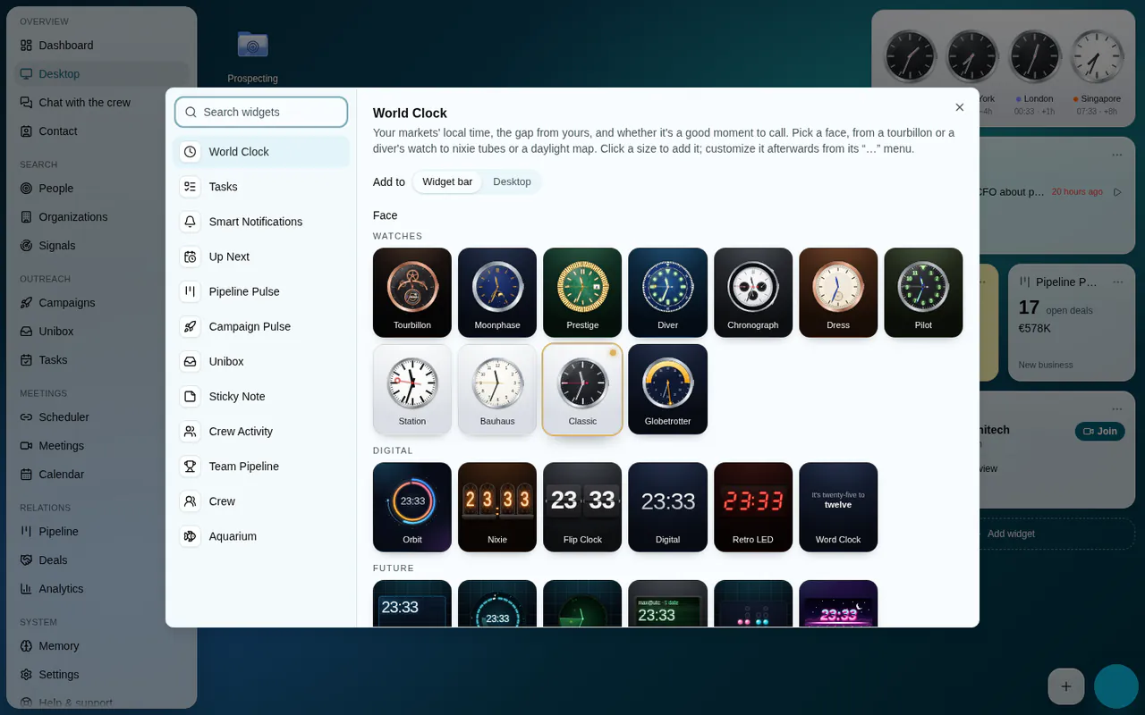
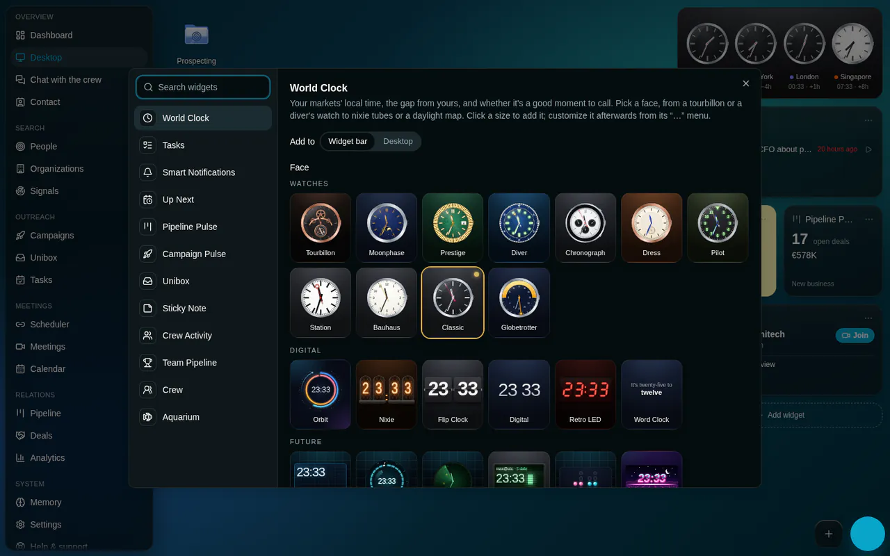
Add widget (the + panel's Widget, Add widget… in the desktop's menu, Add widget under the bar, Desktop Settings › Widgets, Settings › Desktop) opens the gallery: the widgets on the left, with a search that also matches words such as "calendar" or "post-it", and the chosen widget on the right in each of its sizes, rendered live and inert, with a + to add it.
- While the desktop shows, Add to picks the widget bar (the default) or the desktop (the default while the bar is hidden). Extra Large, offered only then, always goes on the desktop.
- Adding to the bar turns a hidden bar back on, and a bar on hover slides out to show the new widget. A new widget scrolls into view and flashes.
Customize… and Reset#
Every widget's menu (a right-click, or its "…" shown on hover) has Customize…, also reachable from Desktop Settings › Widgets.
- It edits the title (empty keeps the catalogue's name), the size, the accent (a stripe along the top and a tinted icon, in ten colours) and the widget's own settings.
- Each change saves as it is made and shows on the widget at once; Done closes the dialog. The whole session is one undo step: ⌘Z afterwards puts the widget back as it was when the dialog opened.
- Reset puts the title, accent and options back to a new widget's defaults and keeps what the widget holds: its size and place, the clock's cities, the note's text. It is disabled while nothing differs, and its toast has Undo.
- Duplicate widget puts a copy right after the original.
Widgets refresh on a cadence only while the tab is visible, and again when it comes back. A 403 or 404 shows "Not included in your role"; a refresh that fails otherwise keeps what the widget shows, and only a first load that fails says "Couldn't load". Their items open in page windows.
Built-in widgets#
Every OS has these two, from the kit.
World Clock: up to 8 cities, each with the gap from local time, the day there and whether it is a good time to call (weekdays 9:00–18:00; an hour either side is the edge of the day). Small, Medium, Large and Extra Large. Twenty-four faces, picked in the gallery or from the widget's Change face and cities…:
| Group | Faces |
|---|---|
| Watches | Tourbillon, Moonphase, Prestige, Diver, Chronograph, Dress, Pilot, Station, Bauhaus, Classic (the default), Globetrotter |
| Digital | Orbit, Nixie, Flip Clock, Digital, Retro LED, Word Clock |
| Future | Mission Control, Holo HUD, Radar, Terminal, Binary, Synthwave |
| Map | Daylight Map |
- Each face sits on its own display case. Background in Customize… keeps it (Match face, the default), puts the clock on the theme's glass card like the other widgets (Theme), or sets any face in one of thirteen cases. On a light ground, the faces that print the time switch to dark inks.
- Seconds hands run on the compositor with the beat each watch would carry (8 a second on the Diver, 10 on the Chronograph, a quartz tick on the Classic); hands sweep in from twelve when a watch appears, and a watch tilts towards the pointer. Transforms and opacity only, so it keeps running in performance mode; reduced motion stops all of it and the hands move once a second.
- Large and Extra Large plan the day: each city's next hours as a ribbon coloured by availability, and the best time to call them all.
- Only Mission Control, Radar and Terminal read the workspace's signals (notifications, deals); they show NO ACCESS, SYNCING or OFFLINE rather than invented data.
Sticky Note: up to 2,000 characters, seven paper colours and a text size. Move to folder files it as a sticky note on the desktop or in a folder; a sticky note's Pin to widgets does the reverse while there is room for another widget, turning a hidden bar back on.
Each app's widgets#
Each OS adds the widgets of its own work to the gallery. Sales OS, the reference, adds:
| Widget | Shows |
|---|---|
| Tasks | Overdue, then due today, then later; tick one to complete it |
| Smart Notifications | Notifications ranked in the browser (critical, important, normal, low), with mark all as read |
| Up Next | The coming meetings with a countdown and Join |
| Pipeline Pulse | A pipeline's open deals and their value |
| Campaign Pulse | Active campaigns, and those that need attention |
| Unibox | The unread count and the latest conversations |
| Crew Activity | What the crew did, people and AI agents, over the last 7 days (Medium and Large) |
| Team Pipeline | Won and open pipeline per member, by week, month or quarter |
| Crew | Who is around now: teammates, Max, digital workers and agents |
| Aquarium | The sales metrics as a living reef in real-time 3D |
Guidelines#
Use a widget for something the member checks many times a day and acts on in one click; the full work belongs in a page window.
What you provide: a catalogue entry (title, description, icon, the sizes it offers with a hint for each, search words) and the widget itself, drawn on the shared card glass in each of its sizes.
Don't invent data when a source fails or the role excludes it, fetch while the tab is hidden, or make a widget that only works at one size.