


Components
Components
131 live components and 15 showcase pages from Crew OS and Max, each with a live preview, guidelines, its API and example code.
No component matches. Try another word, or clear the filters.
Foundations 2
Actions 5
Forms 15
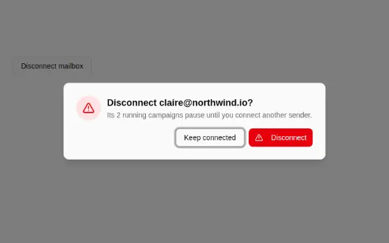
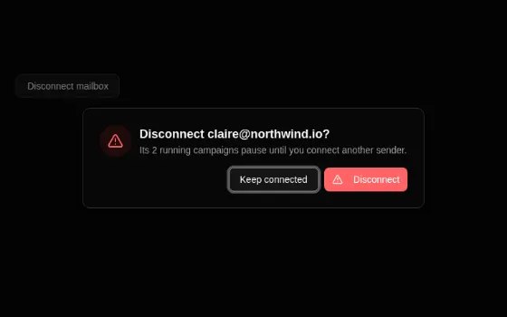
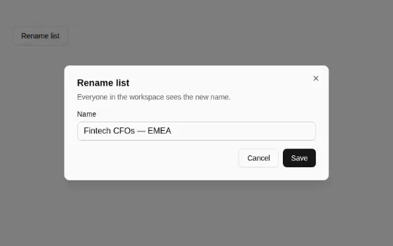
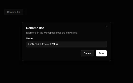
Overlays 10
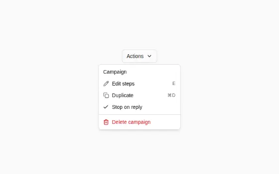
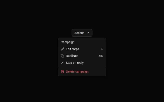
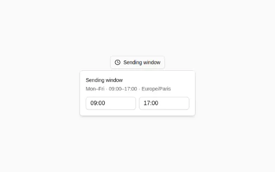
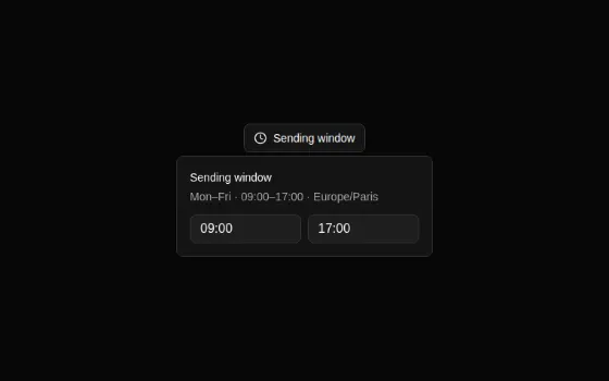
Navigation 7
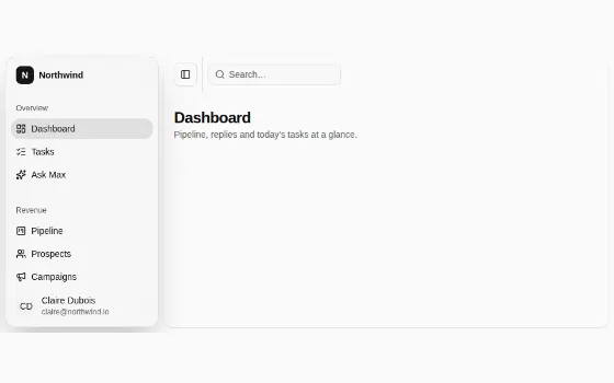
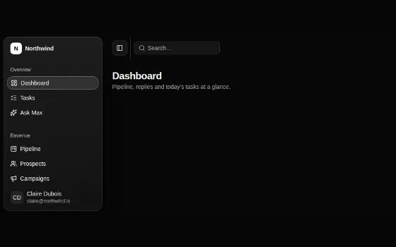
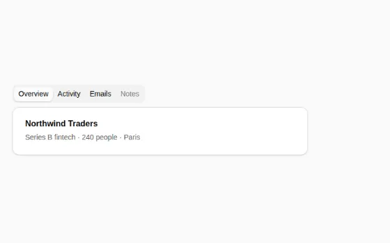
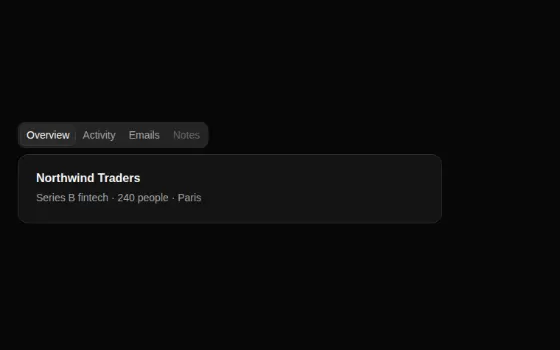
Layout 10
Feedback 6
Data display 14
Agents 9
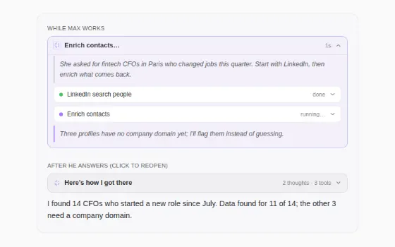
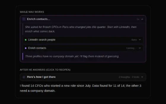
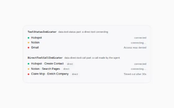
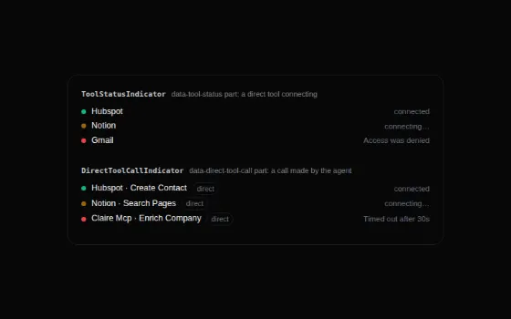
Agent surfaces 1
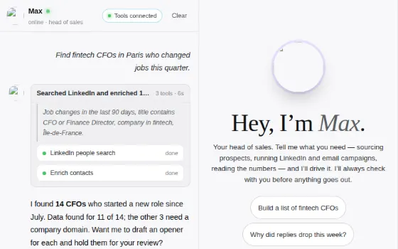
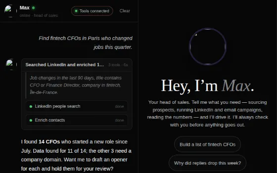
AI 3
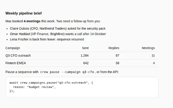
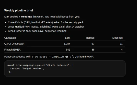
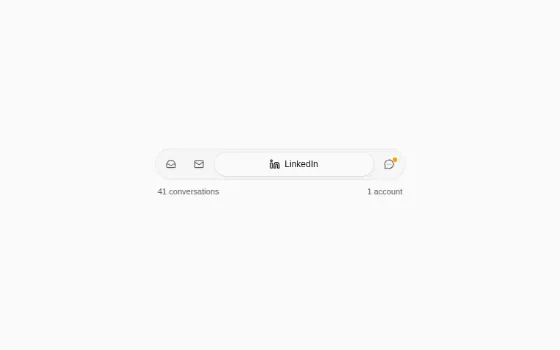
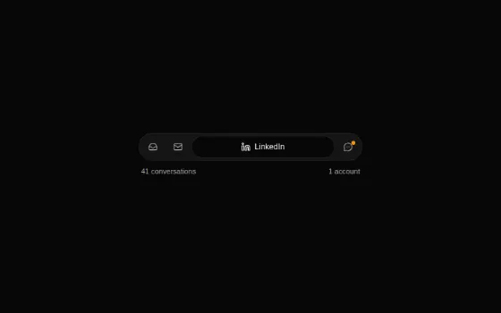
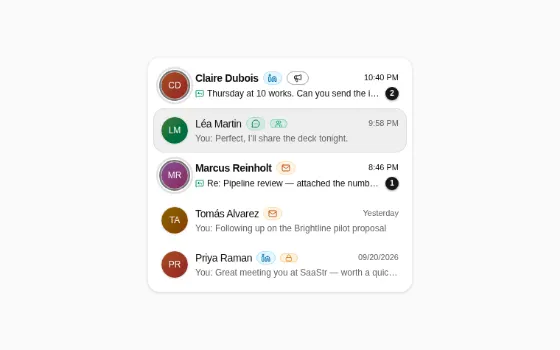
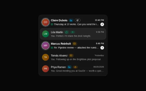
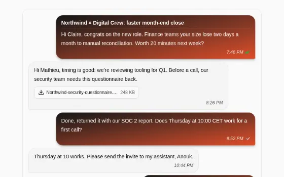
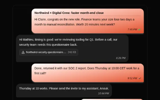
Unibox 7
Analytics 5
Pipeline 5
Motion 21
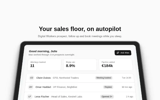
Effects 10
Appearance 2
Marketing 14
About the library#
window.DigitalCrew carries both products' libraries, bundled from their source at the repositories' pinned versions and running on React 19.2.3 (shipped in components/lib/). They read the semantic tokens, so each renders in ink under the Crew OS themes and in orange under the Max themes.
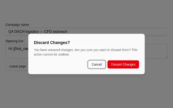
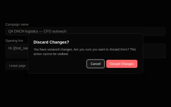
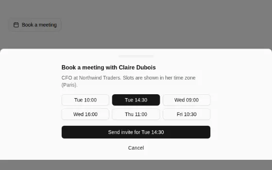
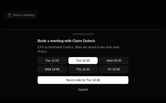
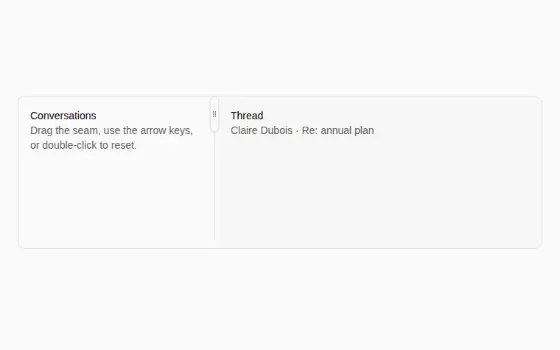
- Primitives (Max's library): Button, Badge, Input, Textarea, Label, Checkbox, RadioGroup, Switch, Select, SecretInput, DateTimePicker, Calendar, PhoneInput, TypedOptionPicker, TimezoneSelector, Dialog, AlertDialog, ConfirmDialogProvider, DiscardChangesDialog, Sheet, Popover, DropdownMenu, Tooltip, HelpTooltip, Command, Tabs, Pagination, Sidebar, Card, Separator, Accordion, Collapsible, ScrollArea, Table, PanelSplitter, Skeleton, Progress, Toaster, Avatar.
- Primitives only Crew OS has: Alert, Breadcrumb, ChartContainer (recharts 2 via
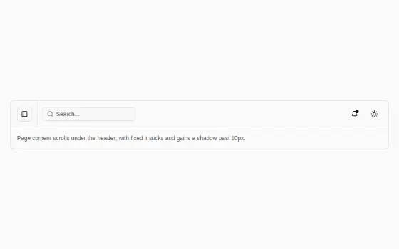
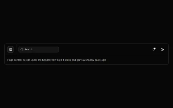
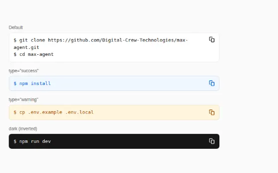
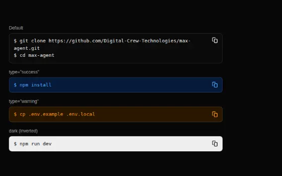
Recharts), Drawer, Form (useForm), Slider, Toggle, ToggleGroup, GlassButton. - App shell: Main, Header, ContentSection, ThemeSwitcher, ListMapToggle, Snippet, the data-table kit (DataTableToolbar, DataTableColumnHeader, DataTablePagination, DataTableBulkActions,
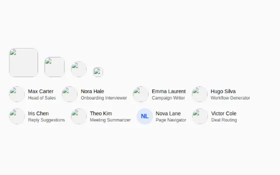
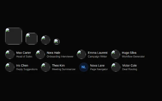
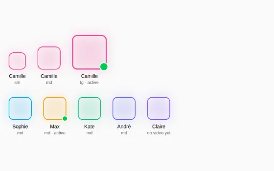
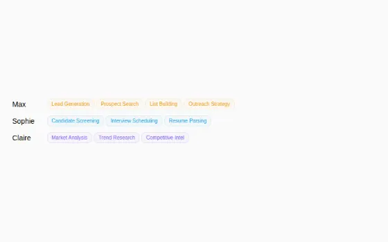
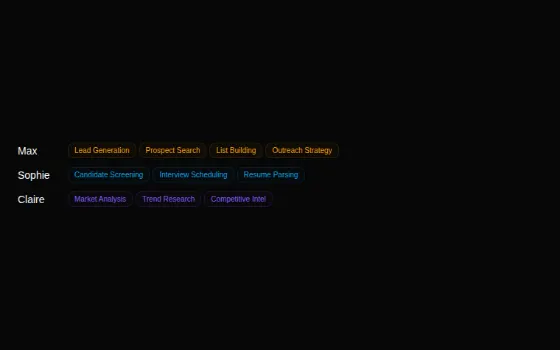
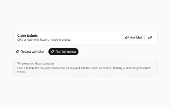
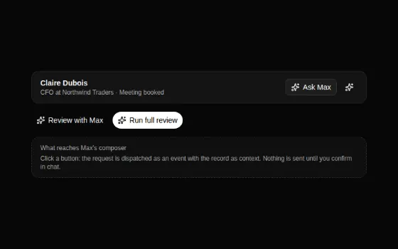
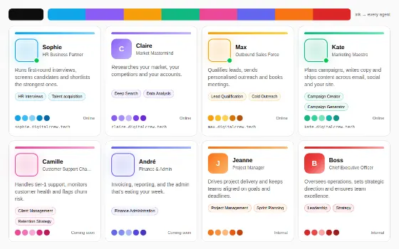
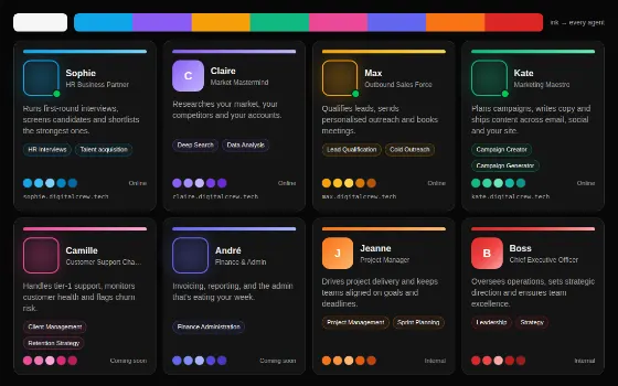
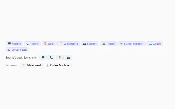
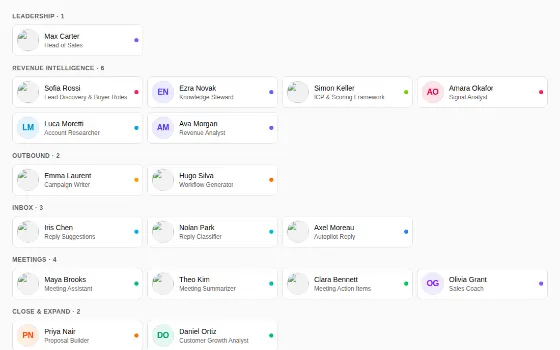
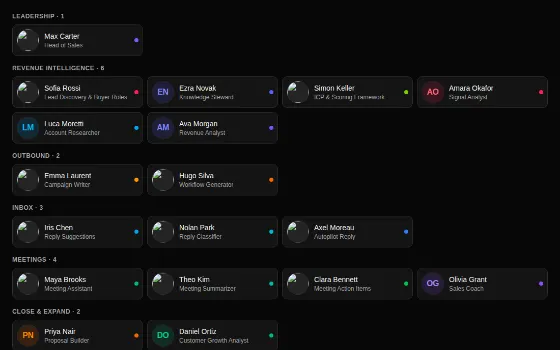
useDataTable). - Agents: AgentFace, AgentPortrait, AgentAvatar, AgentSkillTag, BrandBadge, EquipmentBadge, ThinkingBox, AskMaxAction, ToolStatusIndicator, OAuthRequestCard, plus the CrewAgents, MaxRoster, AgentAccents and MaxChat pages.
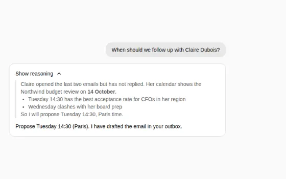
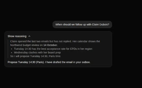
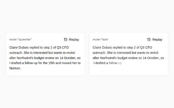
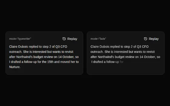
- AI text: Markdown, ResponseStream, Reasoning, and the ShimmerText / StreamingText motion cards.
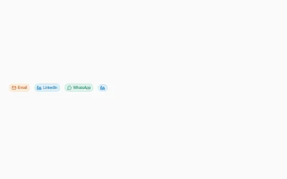
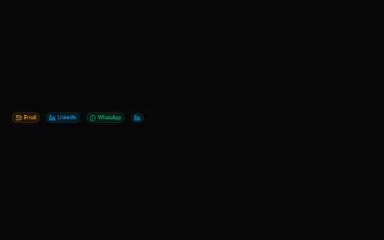
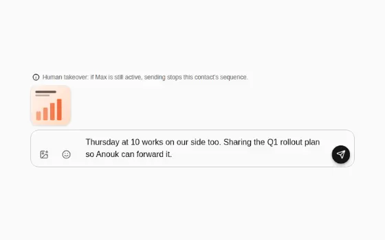
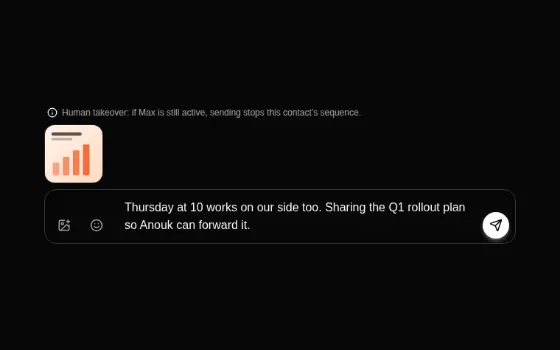
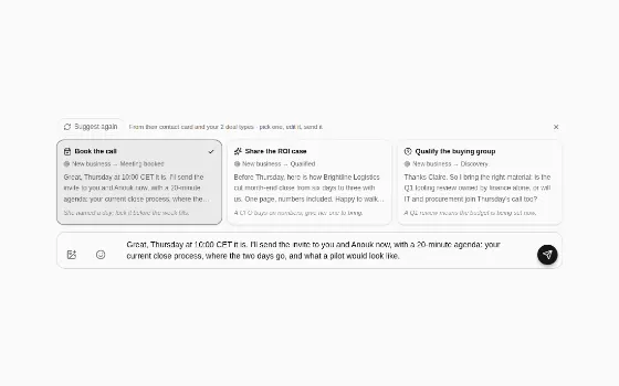
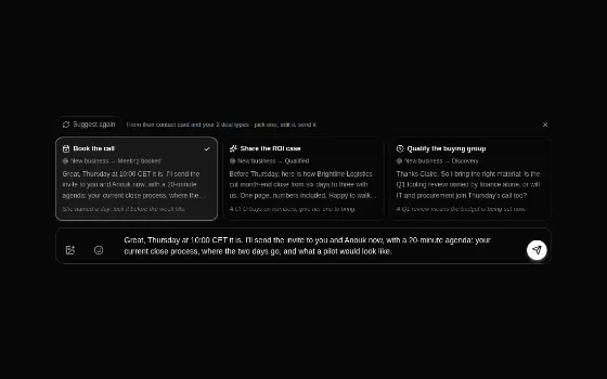
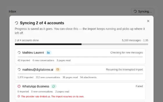
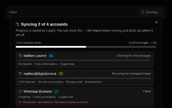
- Unibox: UniboxIdlePanel, ChatListItem, MessageBubble, MessageComposer, ChannelSegments, ReplySuggestions, SyncProgressPanel, ChannelBadge, ProspectAvatar.
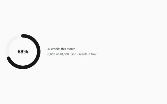
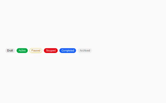
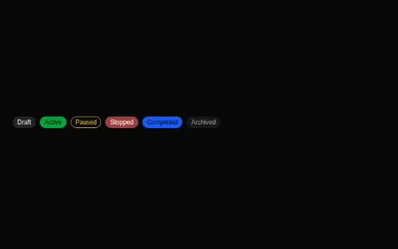
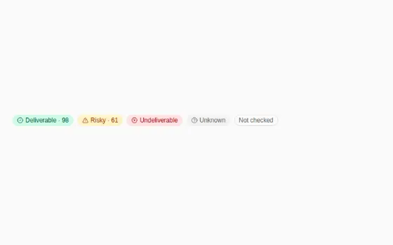
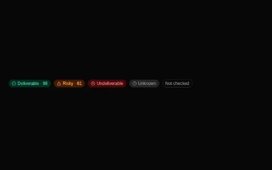
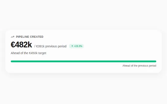
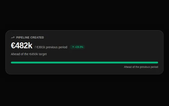
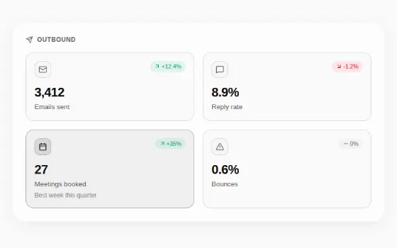
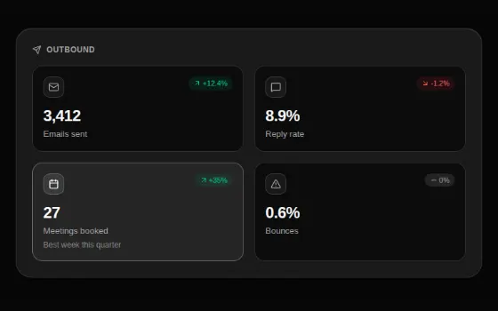
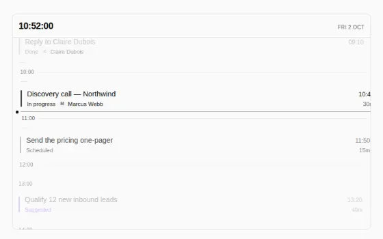
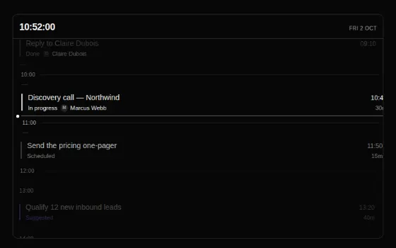
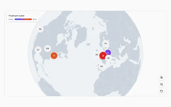
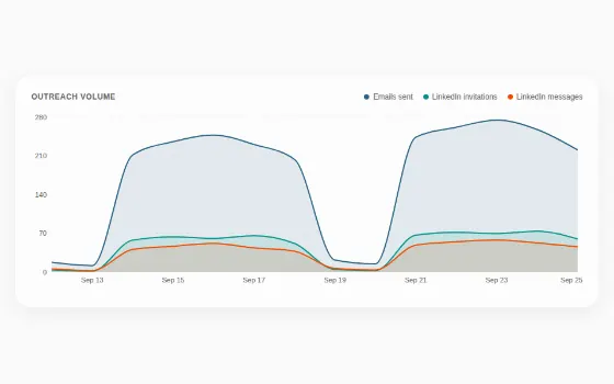
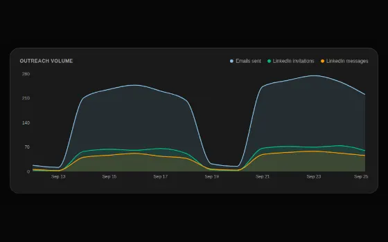
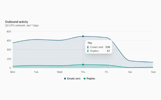
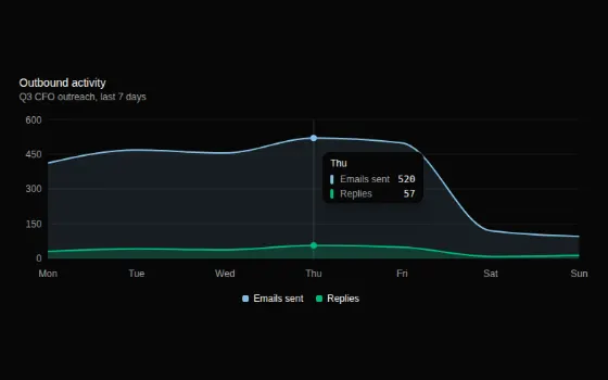
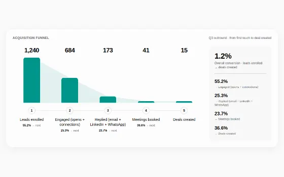
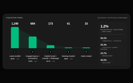
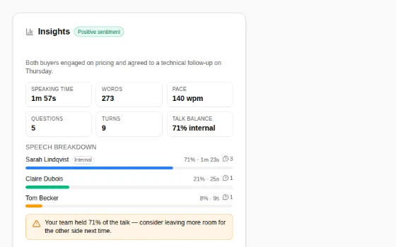
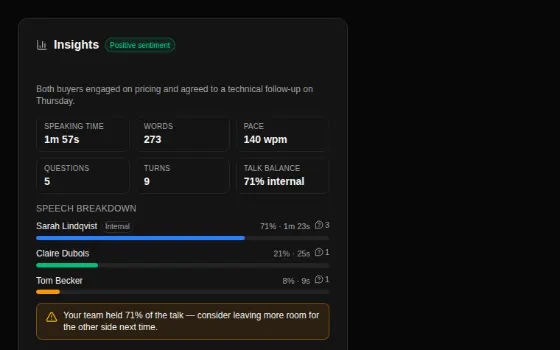
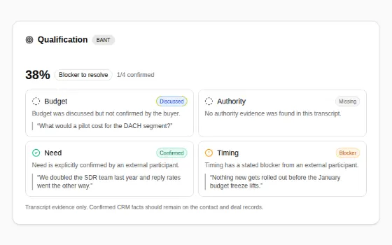
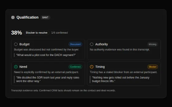
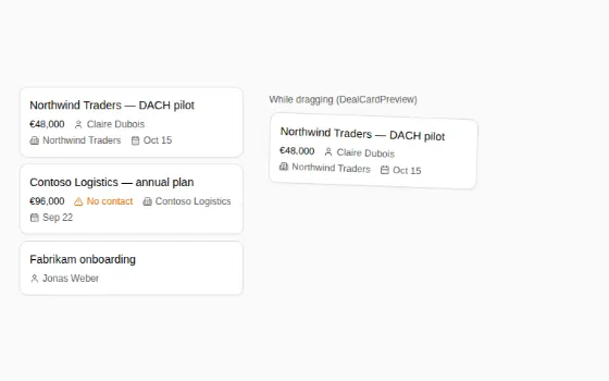
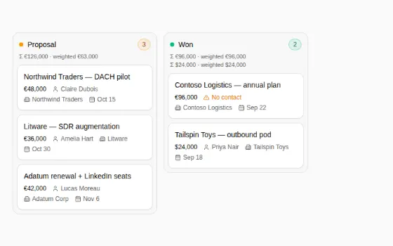
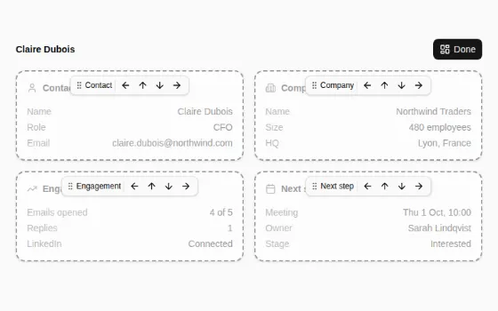
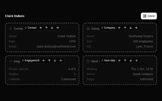
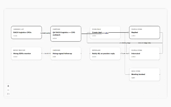
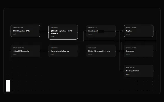
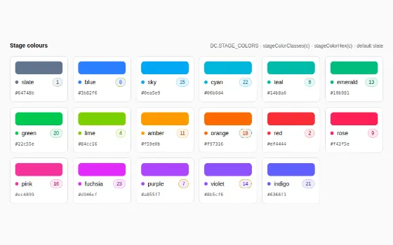
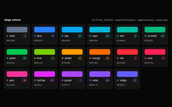
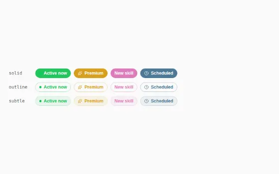
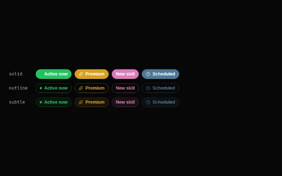
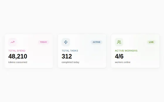
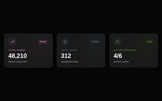
- Analytics and pipeline: KpiCard, HeroMetric, MetricTile, BrandStatCard, ActivityChart, FunnelChart, InsightsCard, QualificationContent, AnimateDigits, AnimatedCircularProgressBar, DealCard, DealColumn, MovableCardGrid, SalesWorkspaceMap, WorldGlobe, TimeLens, CampaignStatusBadge, EmailVerificationBadge, and the StageColors and StatusColors pages.
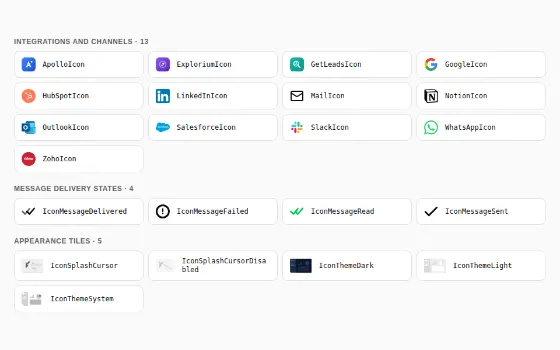
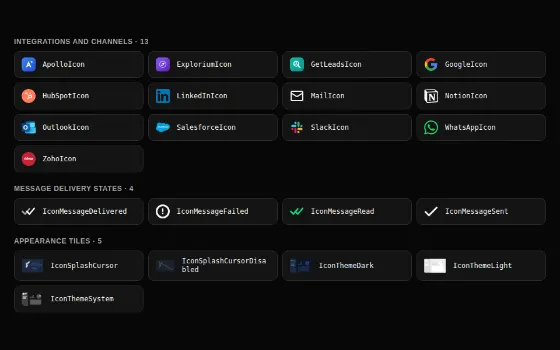
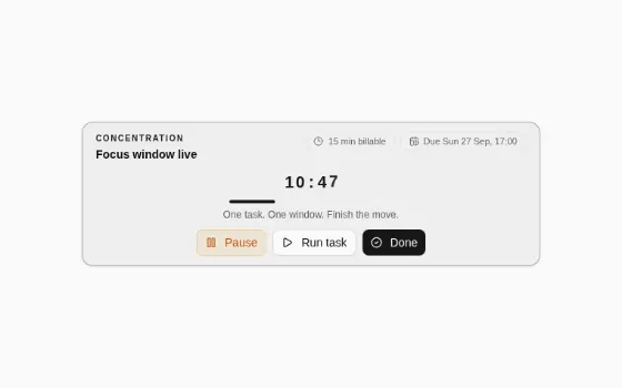
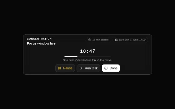
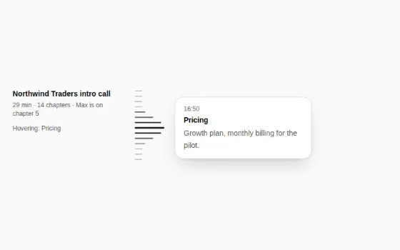
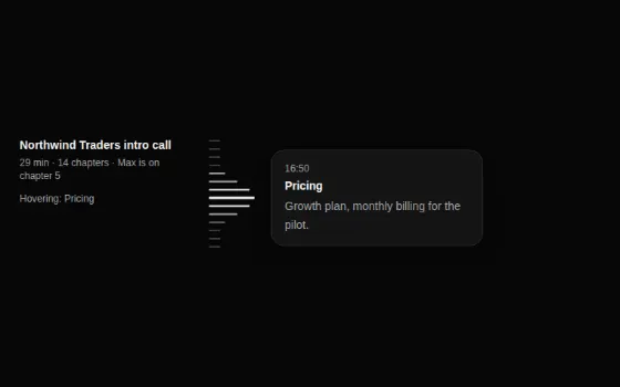
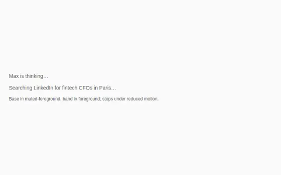
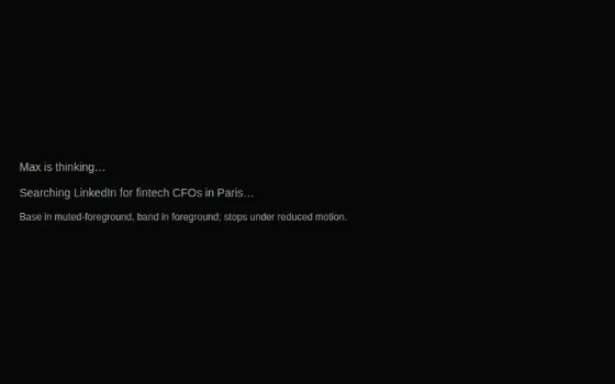
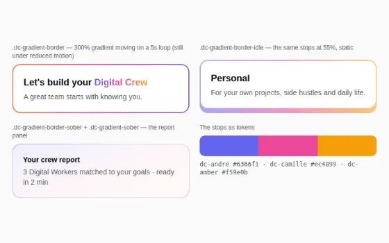
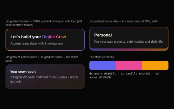
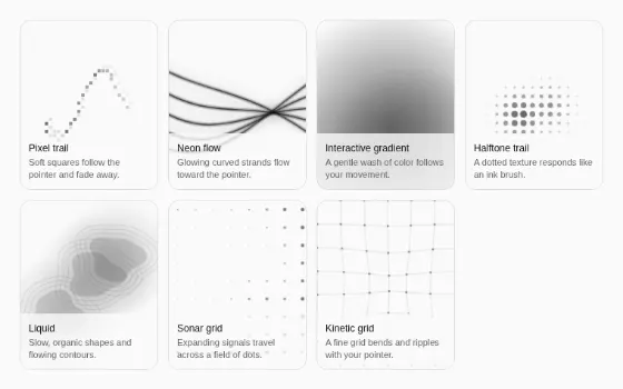
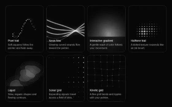
- Motion and effects: MotionScale, ShimmerText, StreamingText, SkeletonReveal, CardResize, SignatureGradient, UniboxMotion, JoyfulTaskCheckbox, ActionFocusSession, ChapterScrubber, FlickeringGrid, GlowingEffect, Marquee, CpuArchitecture, CosmicSynapseCanvas, ContainerScroll, InfiniteSlider, ProgressiveBlur, OrbitingCircles, PixelCard, HyperText, Glitchy404, FeatureSlideshow, Globe, FirstBentoAnimation, SecondBentoAnimation, ThirdBentoAnimation, FourthBentoAnimation, NumberFlowCounter, Lottie, BackgroundEffect, SplashCursor.
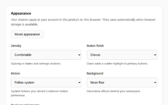
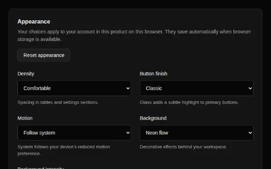
- Appearance: AppearanceProvider, AppearanceControls, SettingsSection, BackgroundEffect — personal density, button finish, motion and background, saved per user and product.
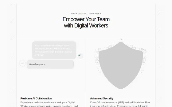
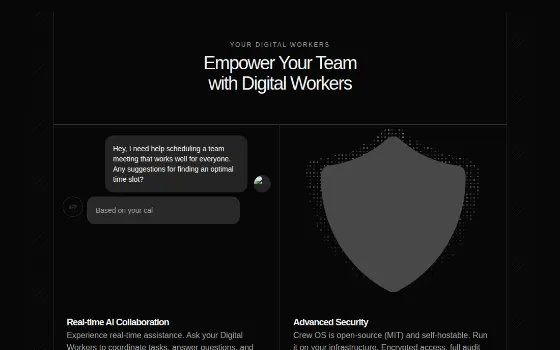
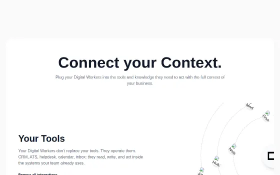
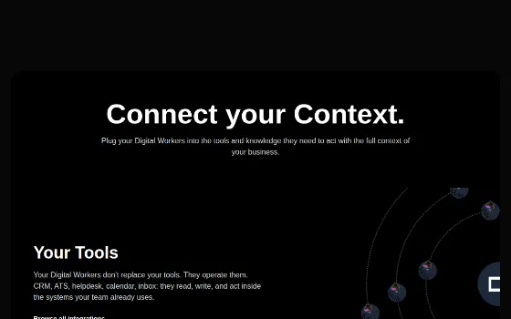
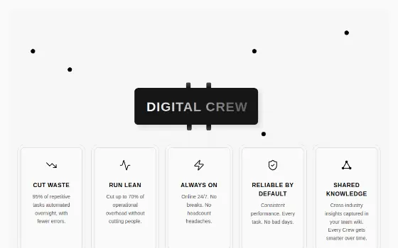
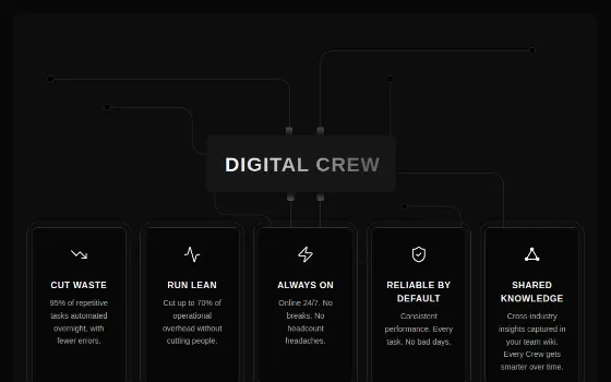
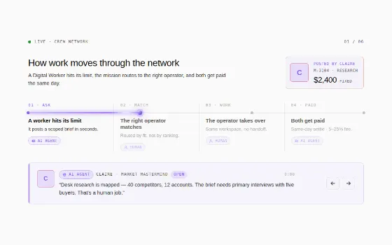
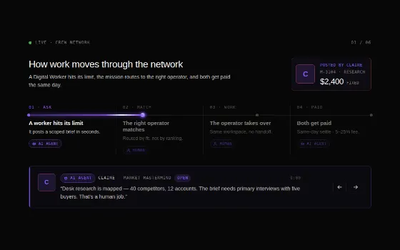
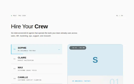
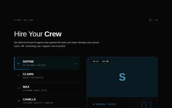
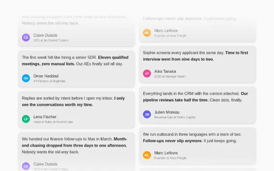
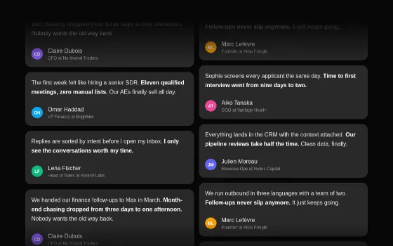
- Marketing sections (Crew OS public site): SectionHeader, SocialProofTestimonials, FeaturesGridWithGlowingEffect, BentoSection, FAQSection, CTASection, SectionSolutions, CpuSuperposition, CrewNetwork, FeatureSection, ConnectSection — with the site's real English copy.
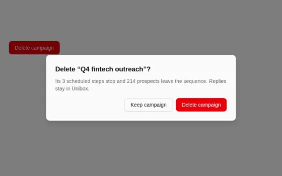
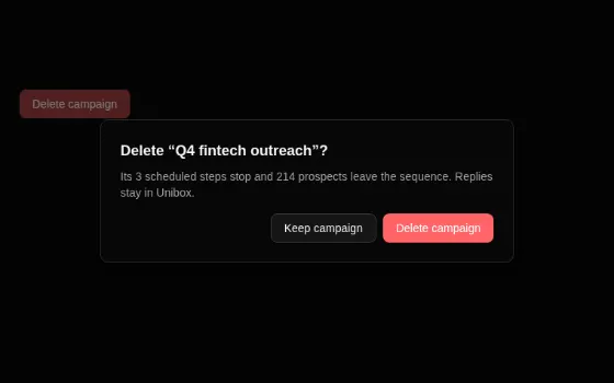
Wrap an app once in TooltipProvider and ConfirmDialogProvider, and mount one Toaster. Confirm destructive actions through useConfirm(), never window.confirm. Components that read next-themes (Globe, FeatureSection, WorldGlobe, Toaster) follow the app's ThemeProvider; outside the apps, wrap them in PageThemeProvider, which follows the page's data-theme.
Where the two apps' copies differ (the bundle carries Max's): Crew OS's Dialog is 400px wide with a radius-xl panel, a darker 80% overlay and z-index 101 (menus 102); its Badge is rounded-md; its Tooltip is primary on primary-foreground; its Select opens as a popper below the trigger; its Switch is 44 × 24px; its Sidebar is the stock two-state shadcn one; its GlowingEffect uses the brand accents (magenta, gold, forest, ocean) where Max's is orange (the bundle carries Crew OS's). The shared @digitalcrew/ui Button, Input and Textarea draw the focus halo at full ring strength (Max: 50%) and support the Glass finish.