


Navigation
Pagination
Numbered page links with previous/next and an ellipsis.
Usage#
Use it for long server-paged lists where position matters. Data tables in Max use their own compact pagination (32px buttons and a rows-per-page select of 10–50).
What you provide: PaginationContent with PaginationItems holding PaginationPrevious, PaginationLink (isActive on the current page, href for each), PaginationEllipsis and PaginationNext. Show the first, the last and two neighbours of the current page.
Facts#
ProductMax
FamilyNavigation
Global
window.DigitalCrew.PaginationSource
max-agent: src/components/ui/pagination.tsxImport in the app
import { Pagination } from "@/components/ui/pagination";API#
TypeScript declarations emitted from src/components/ui/pagination.tsx.
declare function Pagination({ className, ...props }: React.ComponentProps<"nav">): any;
declare function PaginationContent({ className, ...props }: React.ComponentProps<"ul">): any;
declare function PaginationItem({ ...props }: React.ComponentProps<"li">): any;
type PaginationLinkProps = {
    isActive?: boolean;
} & Pick<React.ComponentProps<typeof Button>, "size"> & React.ComponentProps<"a">;
declare function PaginationLink({ className, isActive, size, ...props }: PaginationLinkProps): any;
declare function PaginationPrevious({ className, ...props }: React.ComponentProps<typeof PaginationLink>): any;
declare function PaginationNext({ className, ...props }: React.ComponentProps<typeof PaginationLink>): any;
declare function PaginationEllipsis({ className, ...props }: React.ComponentProps<"span">): any;
export { Pagination, PaginationContent, PaginationLink, PaginationItem, PaginationPrevious, PaginationNext, PaginationEllipsis, };Code#
The preview above, as plain React.createElement against window.DigitalCrew with realistic data. Copy it into a page that loads the bundle.
<div id="root" class="p-6"></div>
<script>
(function () {
  var h = React.createElement, DC = window.DigitalCrew, I = DC.Icons;
function App() {
  return h(DC.Pagination, null,
    h(DC.PaginationContent, null,
      h(DC.PaginationItem, null, h(DC.PaginationPrevious, { href: "#" })),
      h(DC.PaginationItem, null, h(DC.PaginationLink, { href: "#" }, "1")),
      h(DC.PaginationItem, null, h(DC.PaginationLink, { href: "#", isActive: true }, "2")),
      h(DC.PaginationItem, null, h(DC.PaginationLink, { href: "#" }, "3")),
      h(DC.PaginationItem, null, h(DC.PaginationEllipsis, null)),
      h(DC.PaginationItem, null, h(DC.PaginationLink, { href: "#" }, "12")),
      h(DC.PaginationItem, null, h(DC.PaginationNext, { href: "#" }))));
}
  ReactDOM.createRoot(document.getElementById("root")).render(h(DC.TooltipProvider, { delayDuration: 80 }, h(App)));
})();
</script>
More in Navigation#
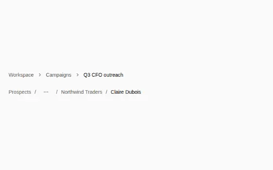

BreadcrumbPage trail: chevron default, collapsed middle
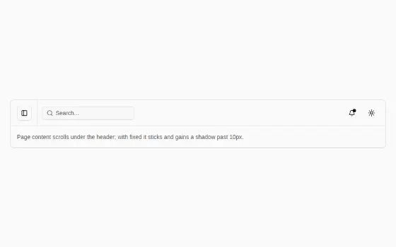

HeaderThe 56/64px top bar: sidebar trigger, search, bell, theme


ListMapToggleList / Map switch for the Saved people and organizations pages
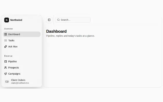
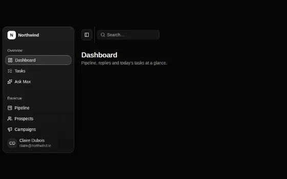
SidebarThe app shell: inset sidebar, header, content
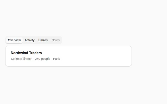

TabsSegmented list with panels
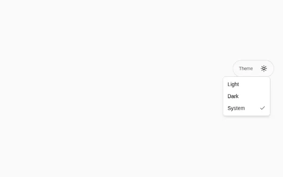

ThemeSwitcherSun/moon button with the Light, Dark, System menu